Usability
The purpose of the subject 'Human Computer Interaction' was to learn the concept of a well done User Interface. This includes the placements of of Icons, the color choice, the design and animation of buttons and the flow of the interface.
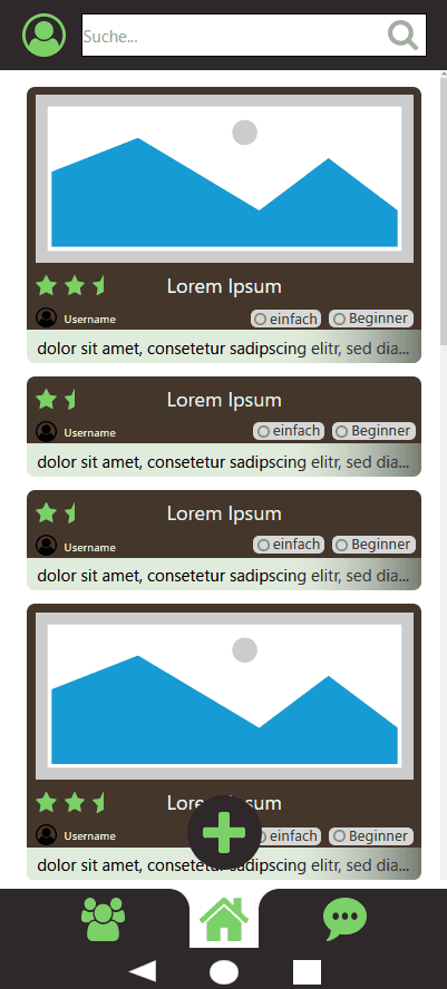
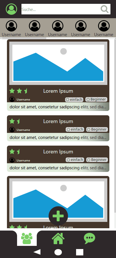
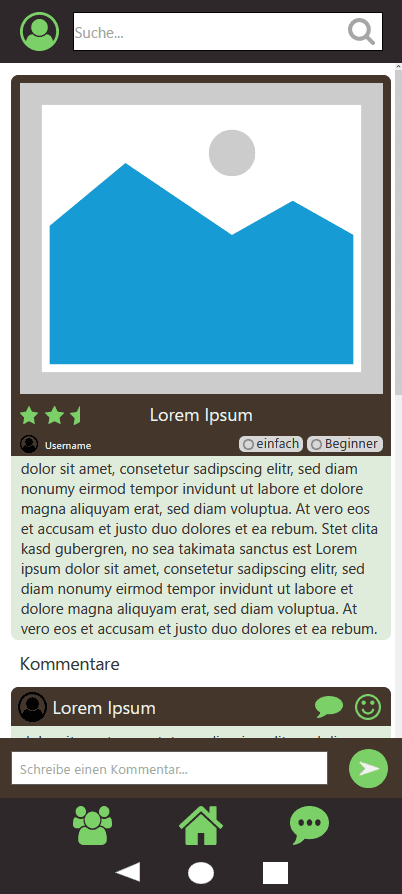
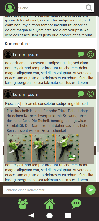
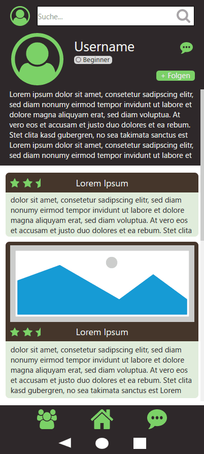
To start I had to come up with an idea and visualize it with a paper prototype. My intention was to design a User Interface for a climbing community app. Its concept contained a main screen, post screen, profile, picture editing and a 3D representation of the climbing gym.

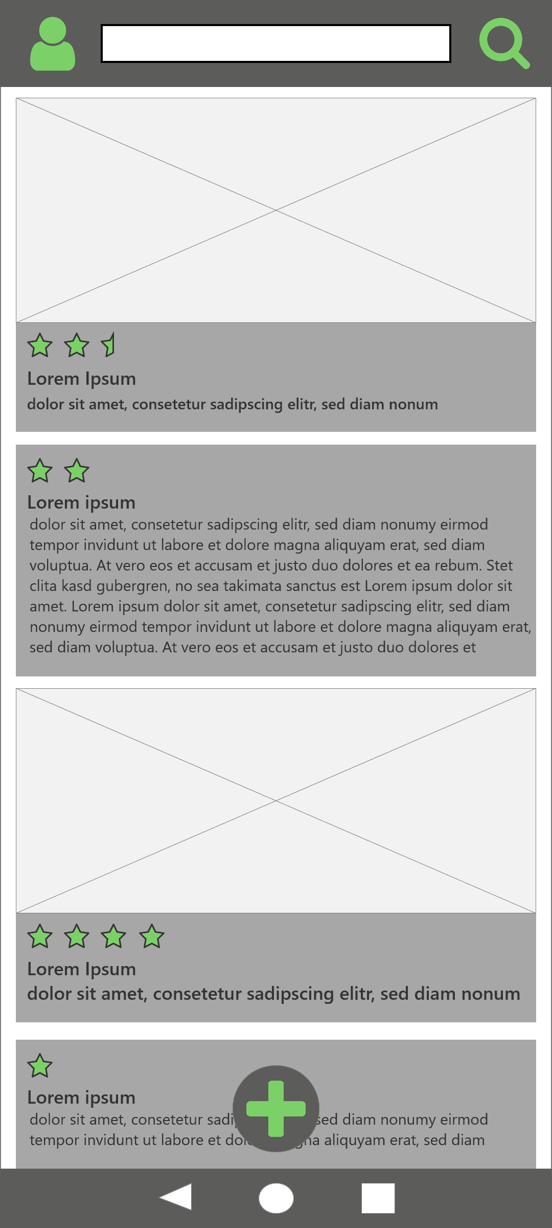
I created my first screen in a software, so my vision can be preceived and potential suggestion of improvements be made.
I got some helpful feedback. The coloration is rather boring and only partly fitting for a climbing app. Also the design was rather stiff, hard and sharp.
I used a color palette generator to fix some of the coloration, cut off some corners and added a little depth. Also I gave the user the opportunity to collect and follow information quicker. Tags were added and displayed to sort and categorize posts and usernames, which were connected to the post right on the main screen.
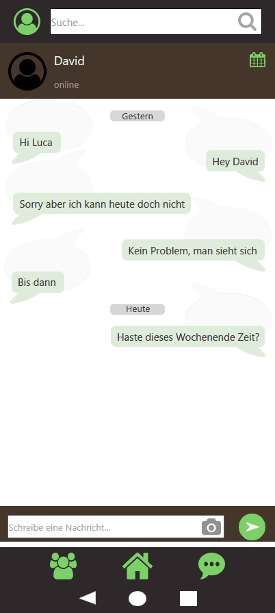
Also since it is an app to connect with people it is useful to have a way of communicating with others in private, so i added the chat section.
